Large and Small Letters: Typographic Design and Class Struggle in Sweden, 1897–1930
The project is a historical study of typographic design and class struggle in the Swedish printing industry during the period 1897-1930.
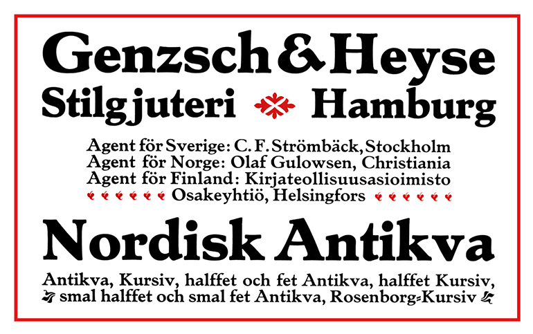 Image: Advertisment in Boktryckerikalender 1910
Around the turn of the 20th century a debate developed within the Swedish printing trade, in which it was argued that printed matter produced in the country ought to reflect national identity. A distinct Swedish typographic style, it was said, would benefit the domestic printing industry. There was an obstacle, however, in the realization of this idea. Swedish printers were dependent on imported printing types, and soon demands were raised for a unique locally produced typeface for the Swedish language. The question of genuine "Swedish letterform" was heavily debated in the trade journals during the first decades of the century, and many proposals for a national typeface were presented, not least through a competition organized in 1916 by the Society of Arts and Crafts (Svenska Slöjdföreningen). There was also an attempt to introduce an altogether new writing system for the Swedish language, which was justified by the argument that the Latin alphabet was not truly Swedish.
The project is aimed at investigating how the discussion on typographic Swedishness developed in the early 1900s, as well as what role it has had in subsequent historiography. The history of typographic design in Sweden is strongly influenced by other 20th century success stories such as the "Swedish model", "Swedish neutrality" and the "record years" (rekordåren). It is a history focused on the interests of business owners and institutions, while perspectives other than national identity and progress are often absent. The project will contribute to understanding how the idea of a particular Swedish typography has been established and how it has overshadowed other interests and conflicts.
The project has had the working title "A Swedish typeface, 1897–1930".
Project manager: Rikard Heberling.
Funded by Ridderstads stiftelse för historisk grafisk forskning.
Project period: 2016–2018.
Publications:
- "Död åt versalerna: när alfabetet blev ett ideologiskt slagfält", Svenska Dagbladet, 2018.04.01
- "'Auktoriteterna i farten': I.G.N. och den nationella typografin", Biblis, nr 80, 2018
- Typographic novelties (Iaspis door numbers), Konstnärsnämnden, 2018
- "Bröderna Lagerström: folkhemmets typografi", Jag vet hur folkhemmet luktar, Konstfack, 2022
- Einar Håkansson, Folkets väl: tidning för tro och fosterland (1906): faksimilutgåva med introduktion av Rikard Heberling och essäer av Evelina Mohei och Mathias Wåg, Arbetarrörelsens arkiv och bibliotek och Förlaget Damm, 2022